Context.IO
Redesigning the go-to tool developers use to leverage email data in their applications.
Overview
CIO is supposed to be the easiest way to integrate email data with any application, but it could and should be easier. This project was a part of our initiative to improve the developer experience and is focused specifically on the developer console.
Role _ research / ux
Tools _ co-creation / affinity mapping / comparative analysis / user stories / as-is scenarios / to-be scenarios / user testing / how might we
Colleagues _ dane carmichael (developer) / cecy correa (developer) / dan corbin (senior product manager)
Status _ handed off and in development
Gathering context
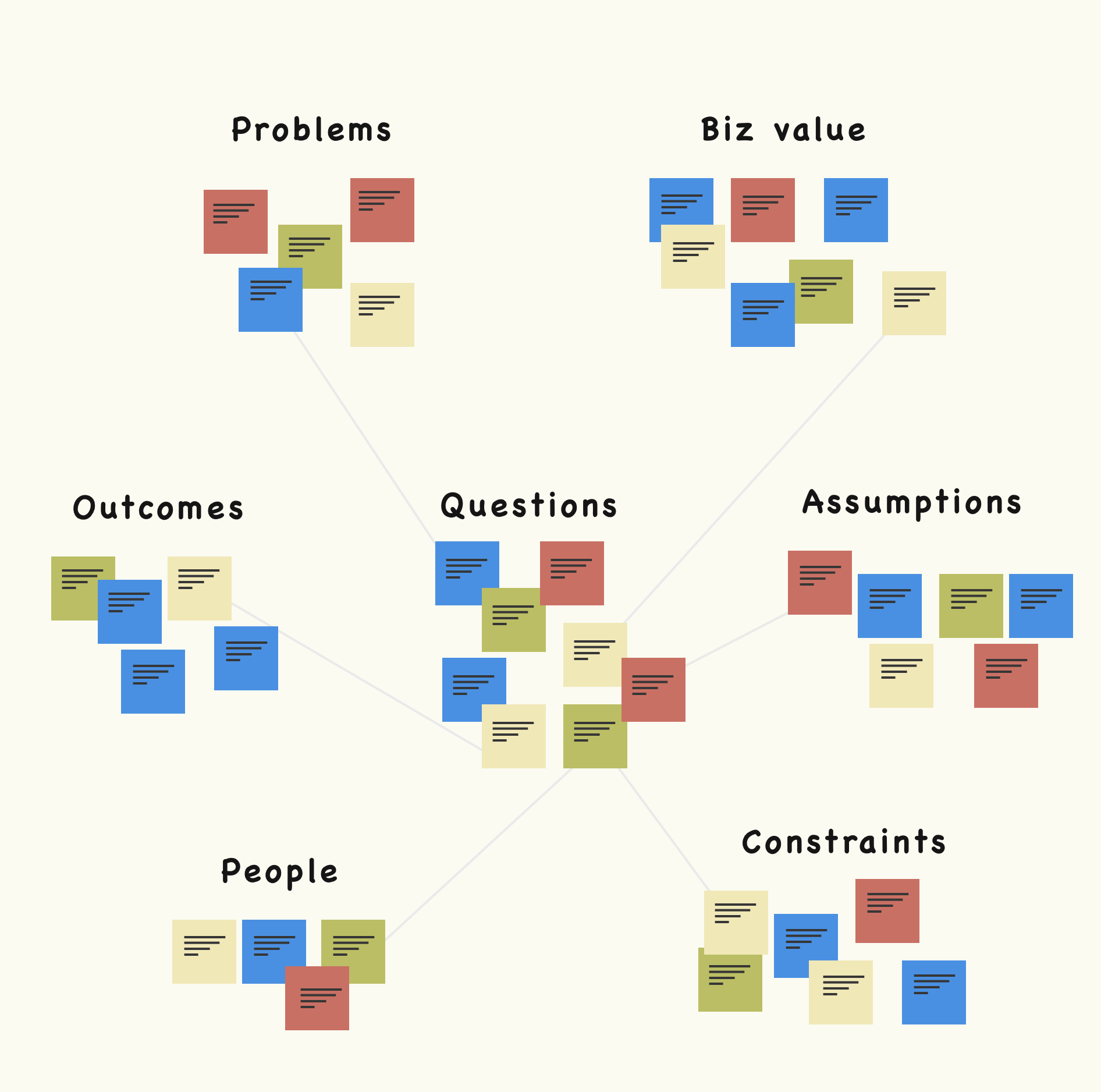
As with any new project, I like to sit down with the people most affected by its outcome to collaboratively build out a requirements document. In the past, I've relied on just the Product Manager to do this, only to later run into all sorts of issues - from misunderstanding technical feasibility to miscues on overall metrics. Everyone has a stake in the project, and design requirements are a great way to account for everyone's thoughts and creativity from the get-go. We broke down the following:
- outcomes / metrics
- business value / user value
- constraints / assumptions
- requirements
- timeline
Users, their experiences and how they feel about us
We established the business goals, expectations and technical constraints, but had a hard time articulating who exactly our core users were today and their expectations. The product we had built was indeed valuable, but it felt like we had lost sight of why that was. I had access to user feedback and usage data and I quickly parsed through it and came to some assumptions:
- the product isn’t necessarily broken, just confusing at times
- users may not be familiar with API’s
- users are early in their careers OR young in age
- only 50% of the features get used
Alignment, business focus and personas
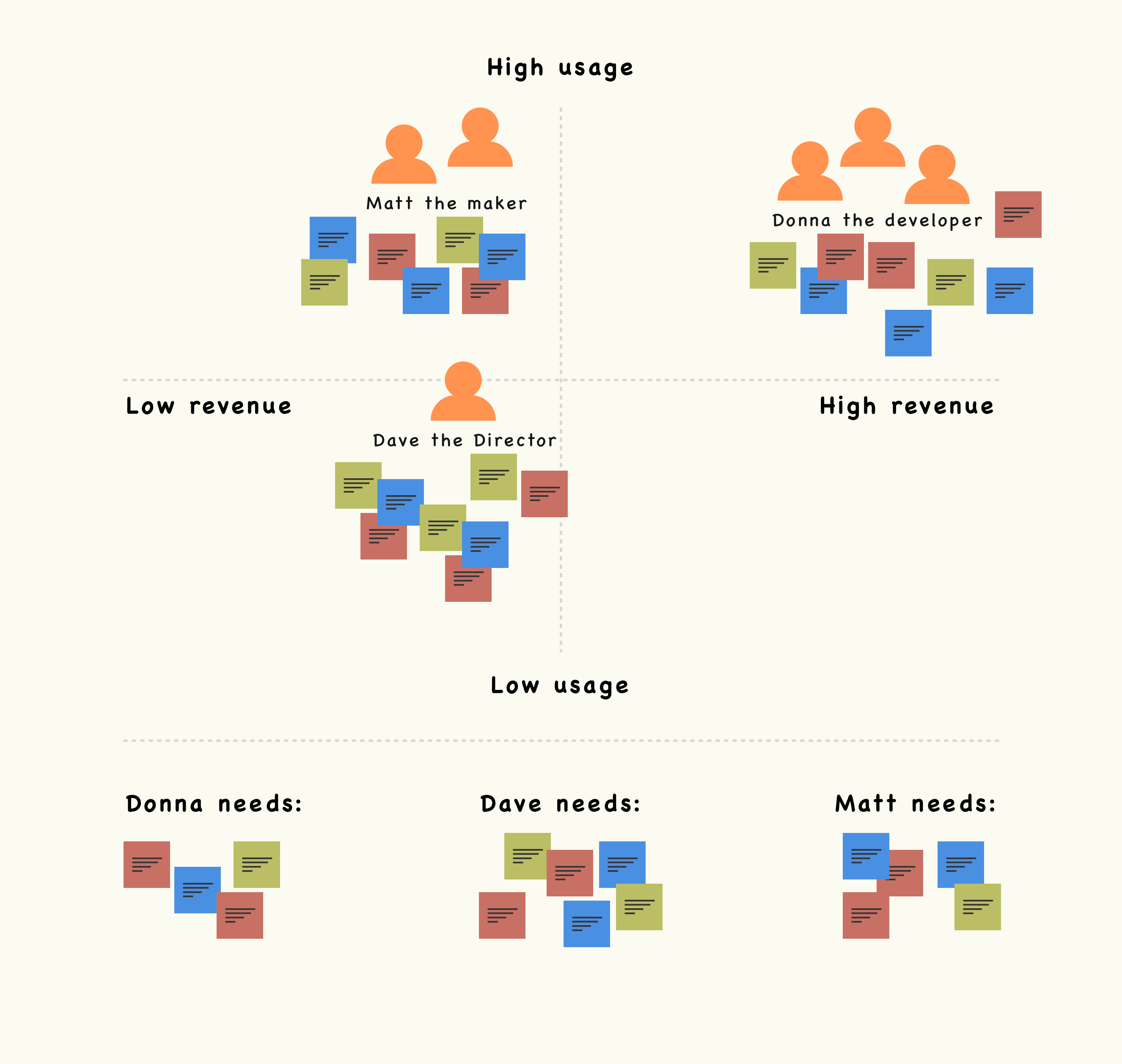
I wasn’t sure if anyone else had seen the same data (or had similar assumptions), so I called a meeting together with my PM and two engineers to get on the same page. In that meeting, we laid out what we thought was true and used both data and personal experience to either support or put to rest those assumptions.
We realized that at no prior point had the CIO team formally defined personas. On paper, CIO had a budding stream of revenue and a massive user base. The question wasn’t so much what’s the problem and who has it as much as it was whose problem are we solving the best, who uses us the most and how can we make it better? To re-frame our understanding, we built out pseudo-personas of all the user types currently using our product and formally defined their needs and use cases. Then we looked at the data and plotted those users on a graph that helped us understand their value to the business.
User interviews and co-creation
After pinpointing who used our product and how much each group contributed to our business, I focused in on the types that we could serve the best. Who do we as a business care about most and what can we do for them?
I was lucky enough to have one of our biggest customers (Moolah) on-site within two weeks of kicking off the project. I set up a co-creation session and the goal for us was to essentially audit the old experience and talk through the following:
- who they work with
- their expectations
- the problem(s) they're solving
- the problems they're having
- ideas they might have for us
Synthesis, comparative analysis and making
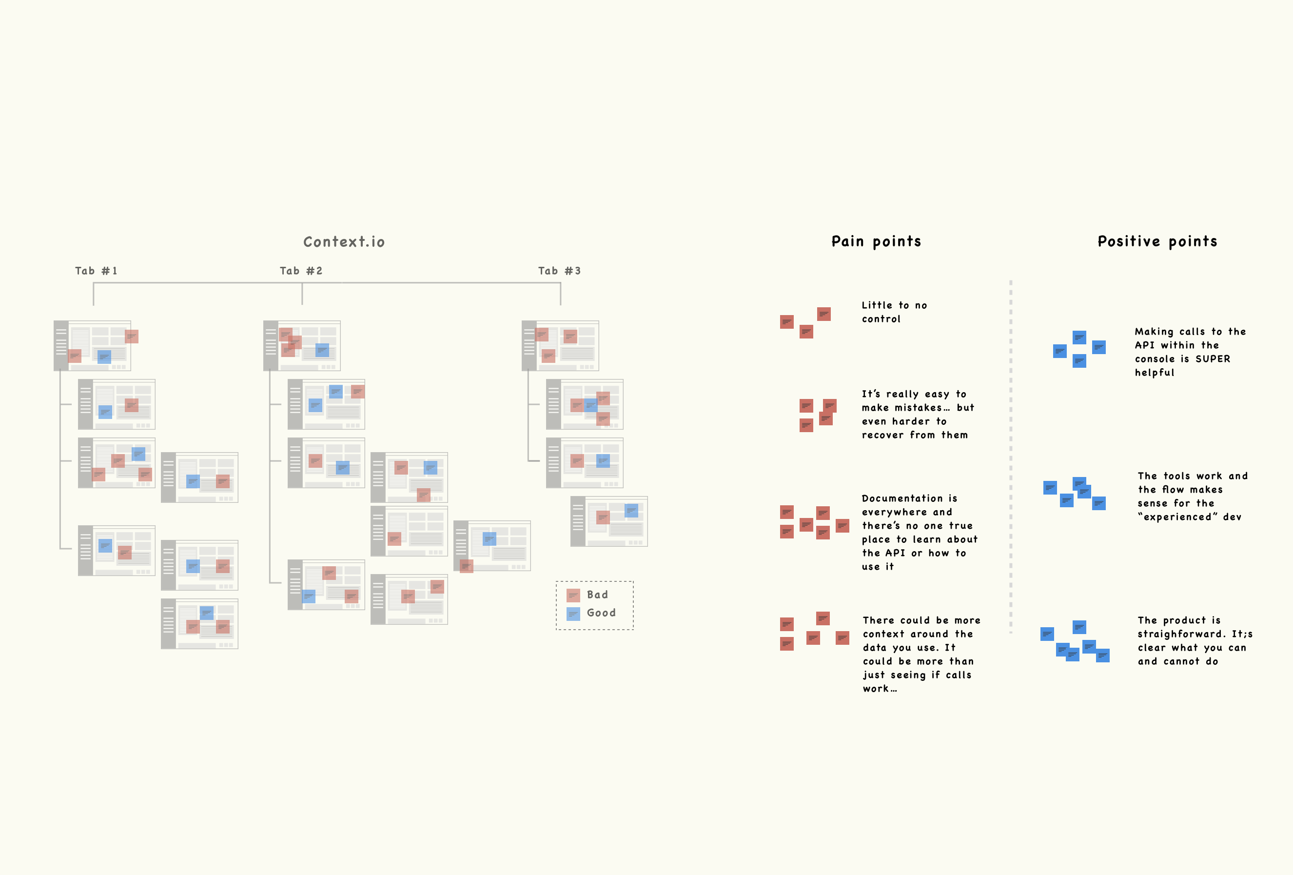
The session I had with clients was a huge help and it allowed me to validate most of the team's assumptions, as well as develop design principles to guide my inspiration and user experience.
I was looking for inspiration from pretty specific use cases. Ones that were focused on documentation, learning, testing and of course, developers as the primary users.
User stories, design principles and getting buy-in
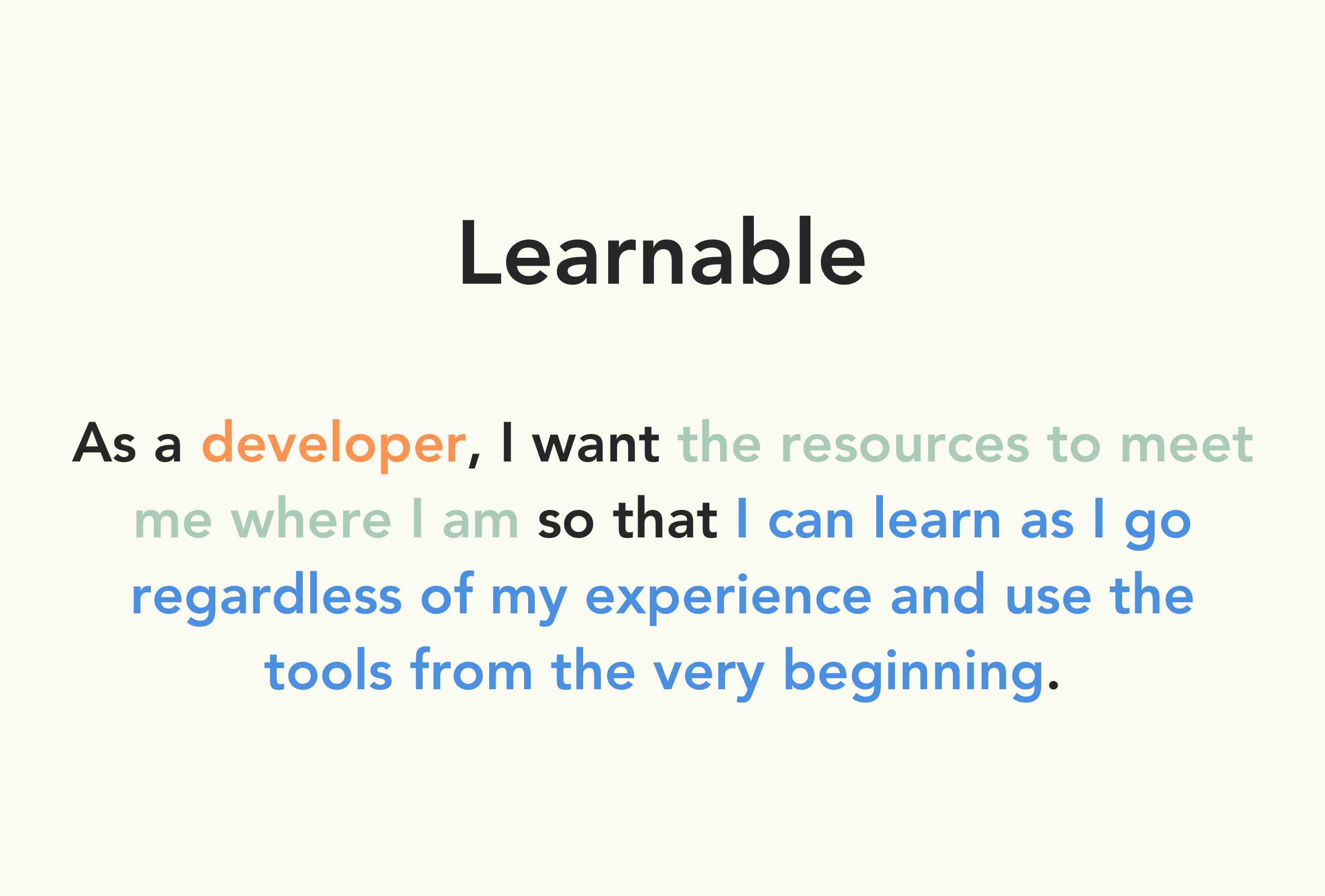
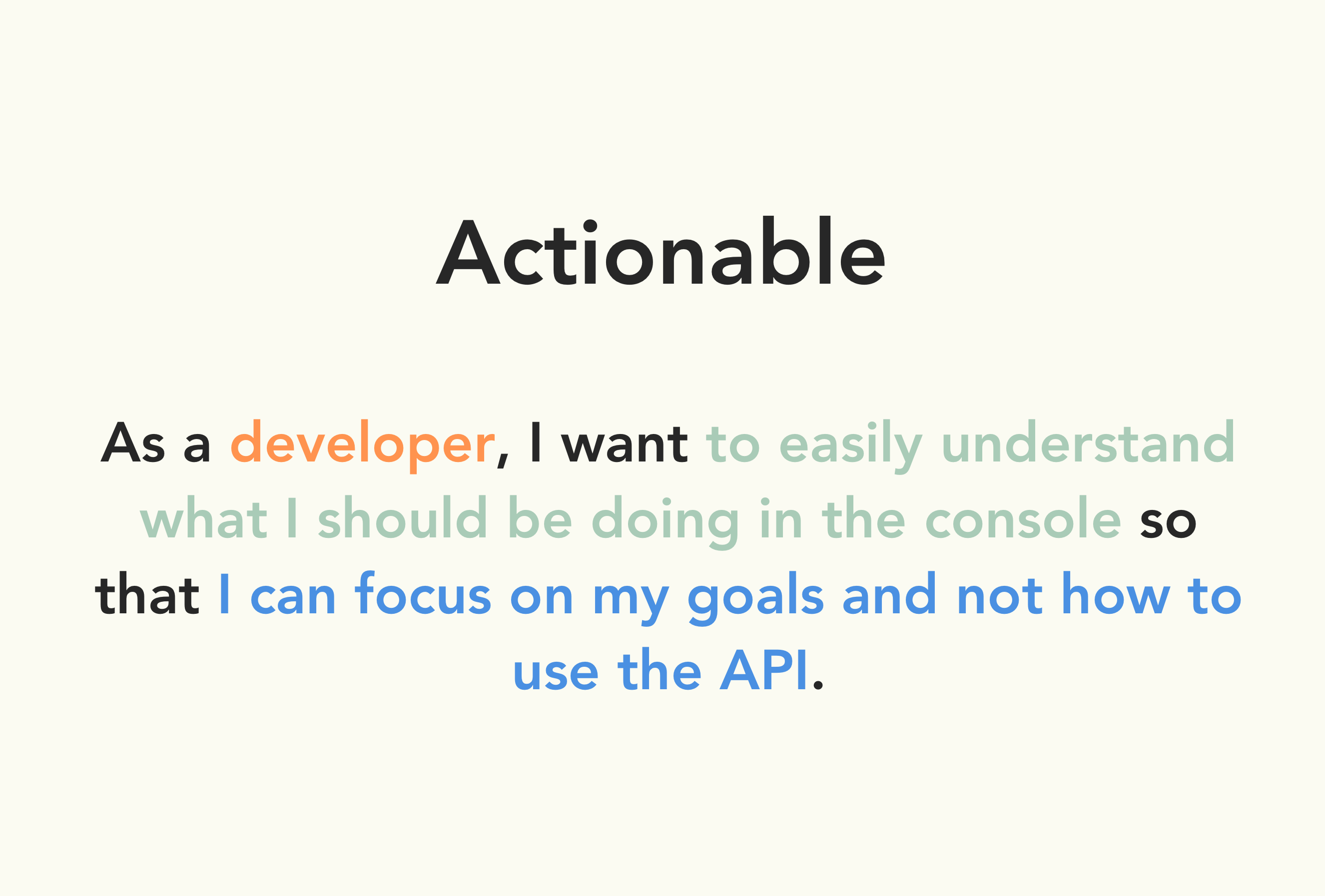
Design principles obviously guide designers as they think about what they're solving and the most important aspects of those possible solutions. Something to note about this project, in particular, is that the team I was working with hadn't collaborated on-site with a designer in close to two years. That disconnect immediately made some of the core tenents of my process much harder to sell and communicate than normal. Buy-in was challenging, BUT more than any other activity, it was defining these design principles through emotional user stories that my team of developers bought into the most. It really helped them consider the why behind what we were building. From then on it became much easier to push for a particular feature or flow because they understood the emotional need behind the technical requests.
Time to value was lacking because a large subset of users would try to accomplish a task or leverage a certain feature, only to give up because the information was disparate and the intuitive details to succeed were non-existent.
Every use case has its flows and the product as it was did very little to account for all possible flows or situations a user might have or expect. It was paramount that users knew how to move towards success AND recover from errors.
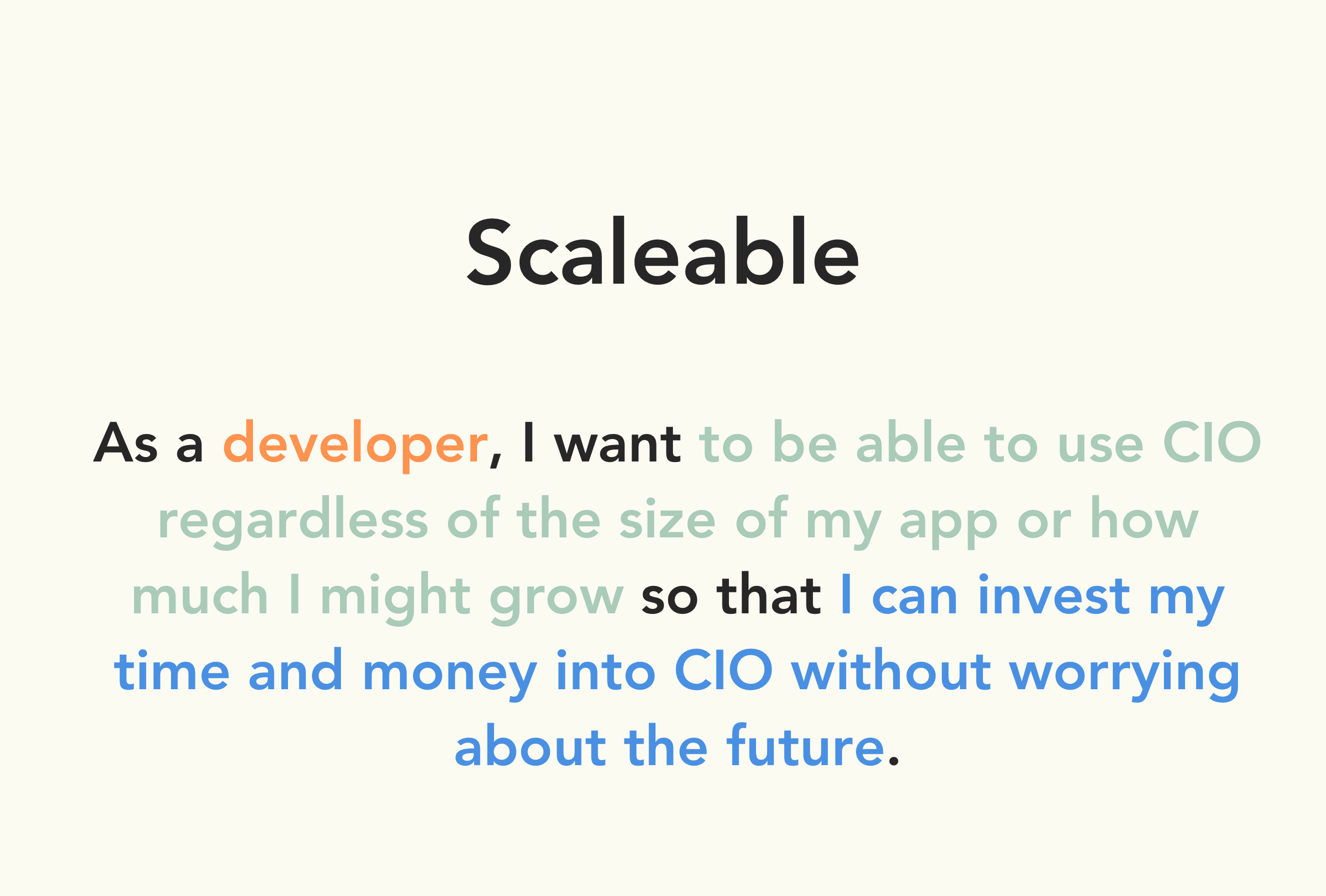
This one was a bit vague in retrospect. CIO's success pattern was very much boom and bust. Early apps would use it, grow exponentially and then churn because of capacity issues. We wanted to squash that issue altogether.
Making, testing and iterating with SME's
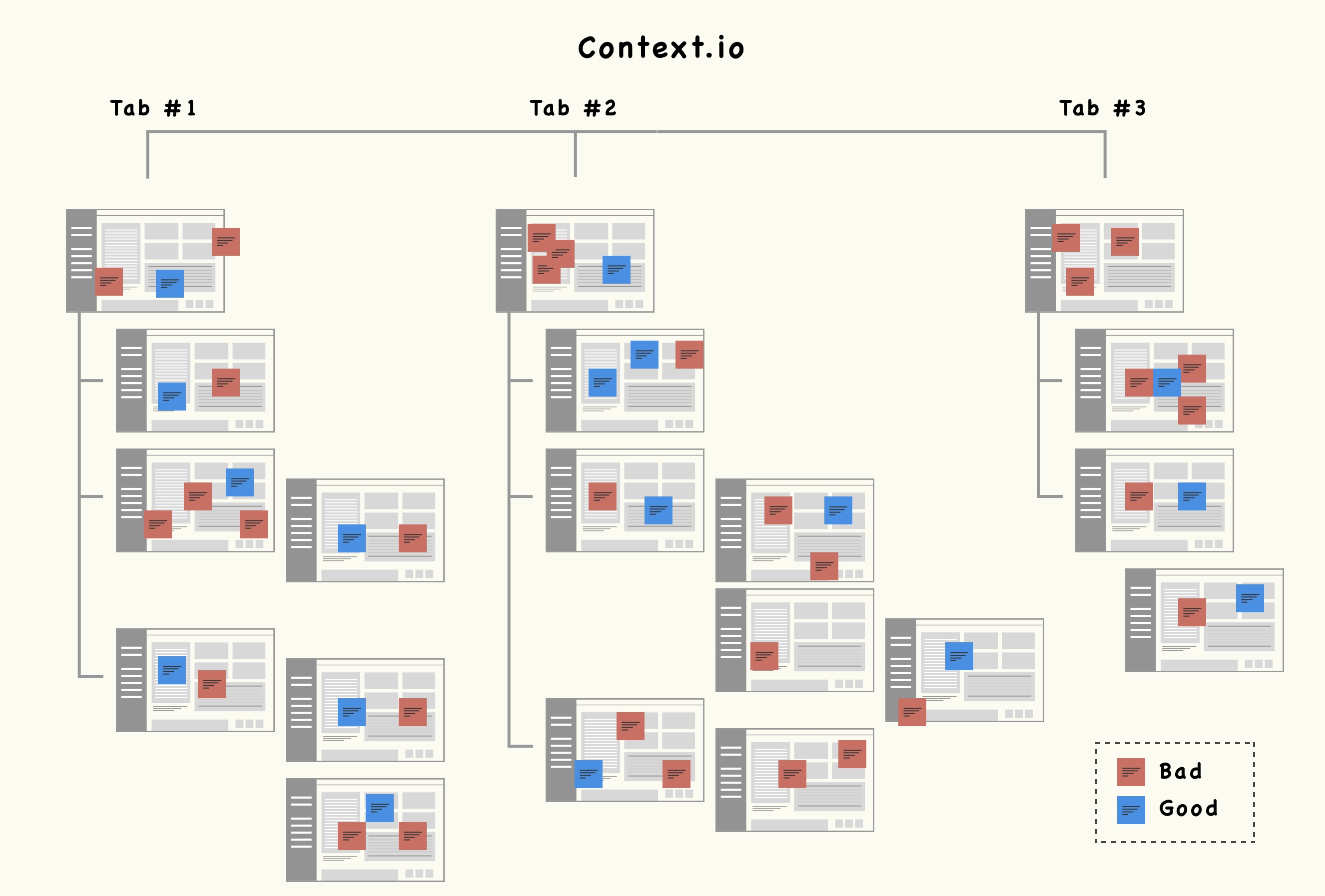
I was one designer in an office of 14 developers - all of which had varied backgrounds and opinions. They were my subject matter experts for most of the version currently in development, and I was lucky enough to eat lunch with them every single day. I used my sme's, design principles, user stories and inspiration to constantly iterate towards a place of validated problem-solution fit. Below are a few iteration highlights.
Logs_before
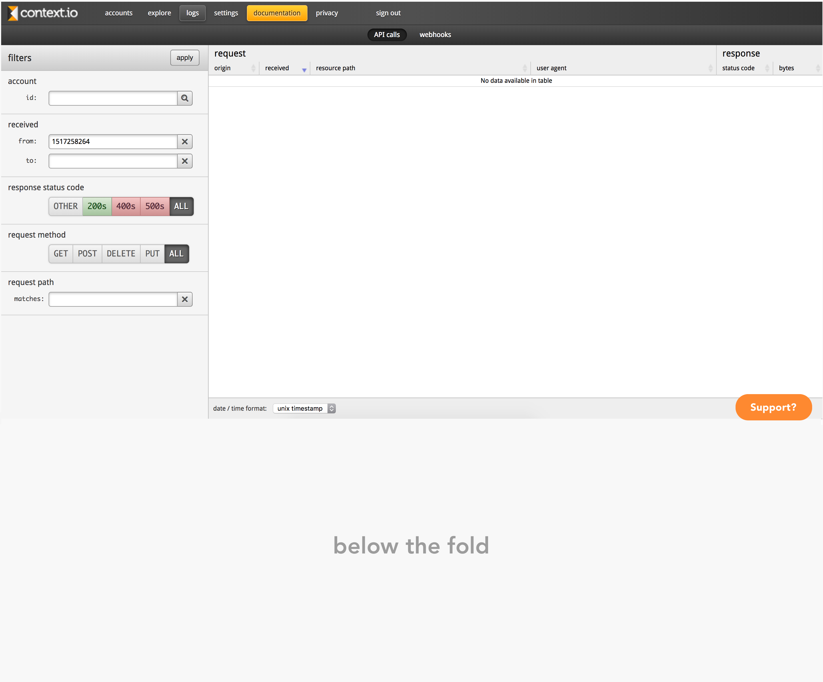
Notes_ lack of minimalist design // unable to understand the relationship between filters and the data tables // lack of context around status codes // limited utility of filters module
Logs_during
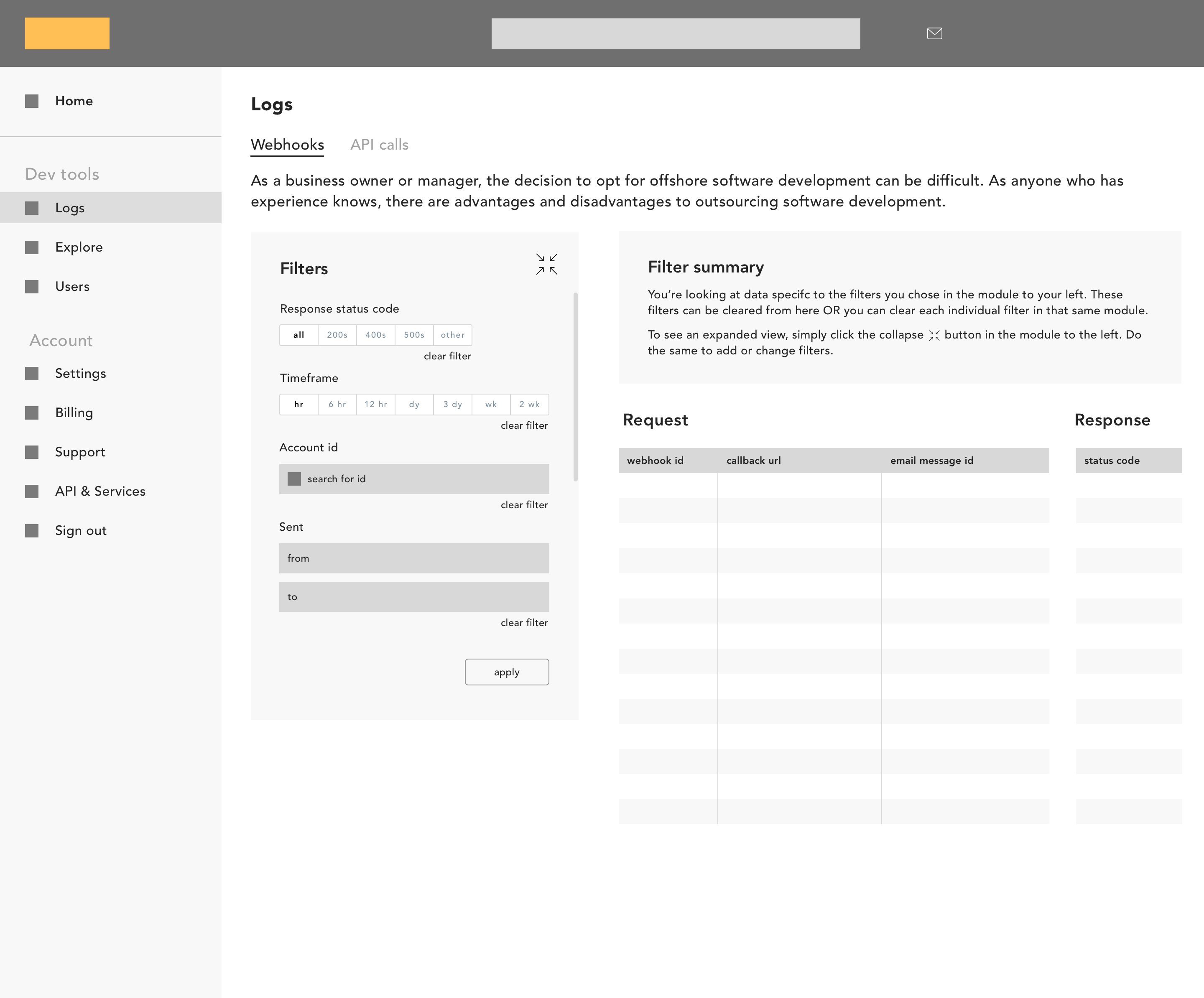
Notes_ confusing visual rhythm // cont. confusion around the relationship between filter and data tables // not enough real estate left to right // users don't need context around the sub-section they're in
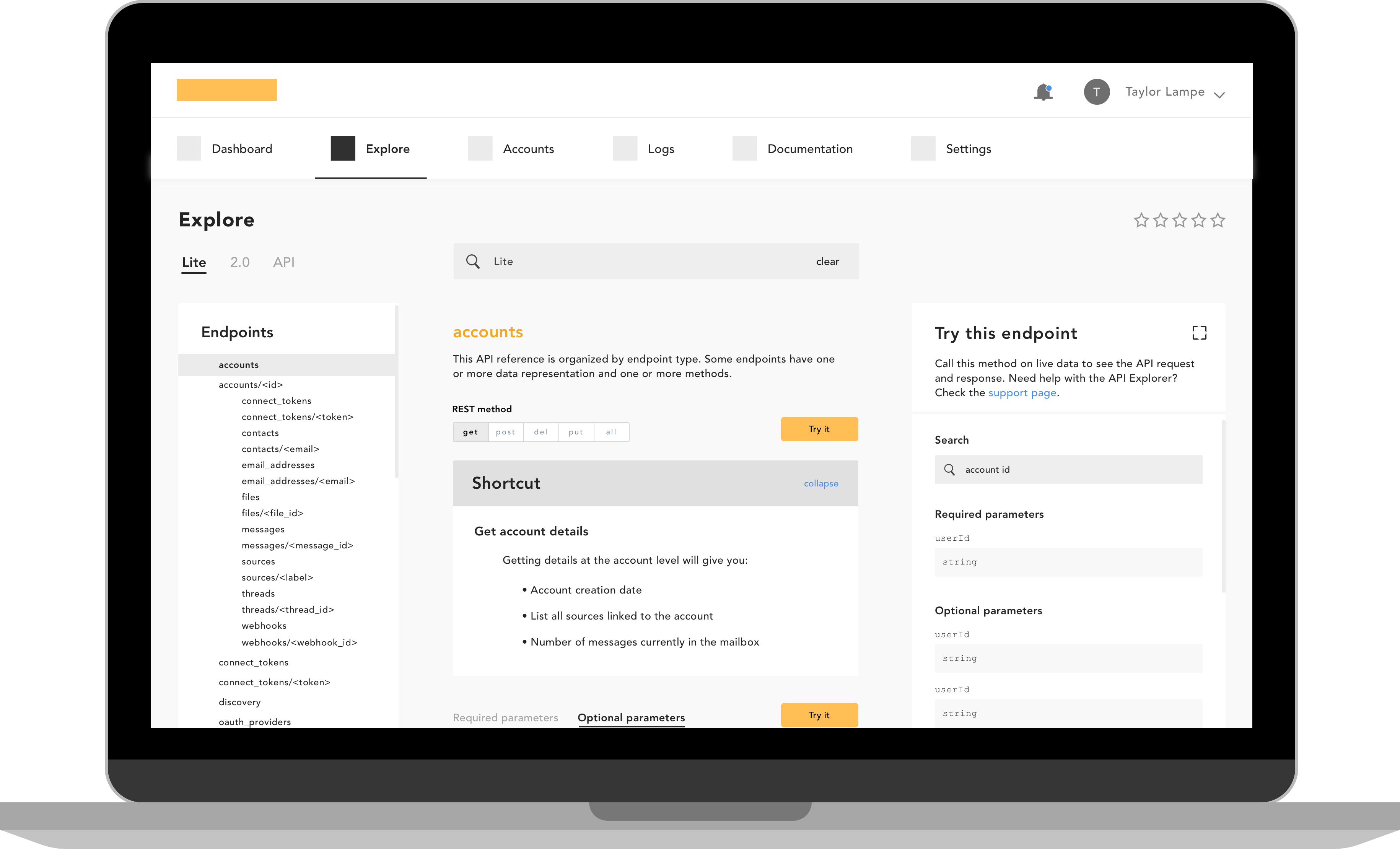
Logs_eventually
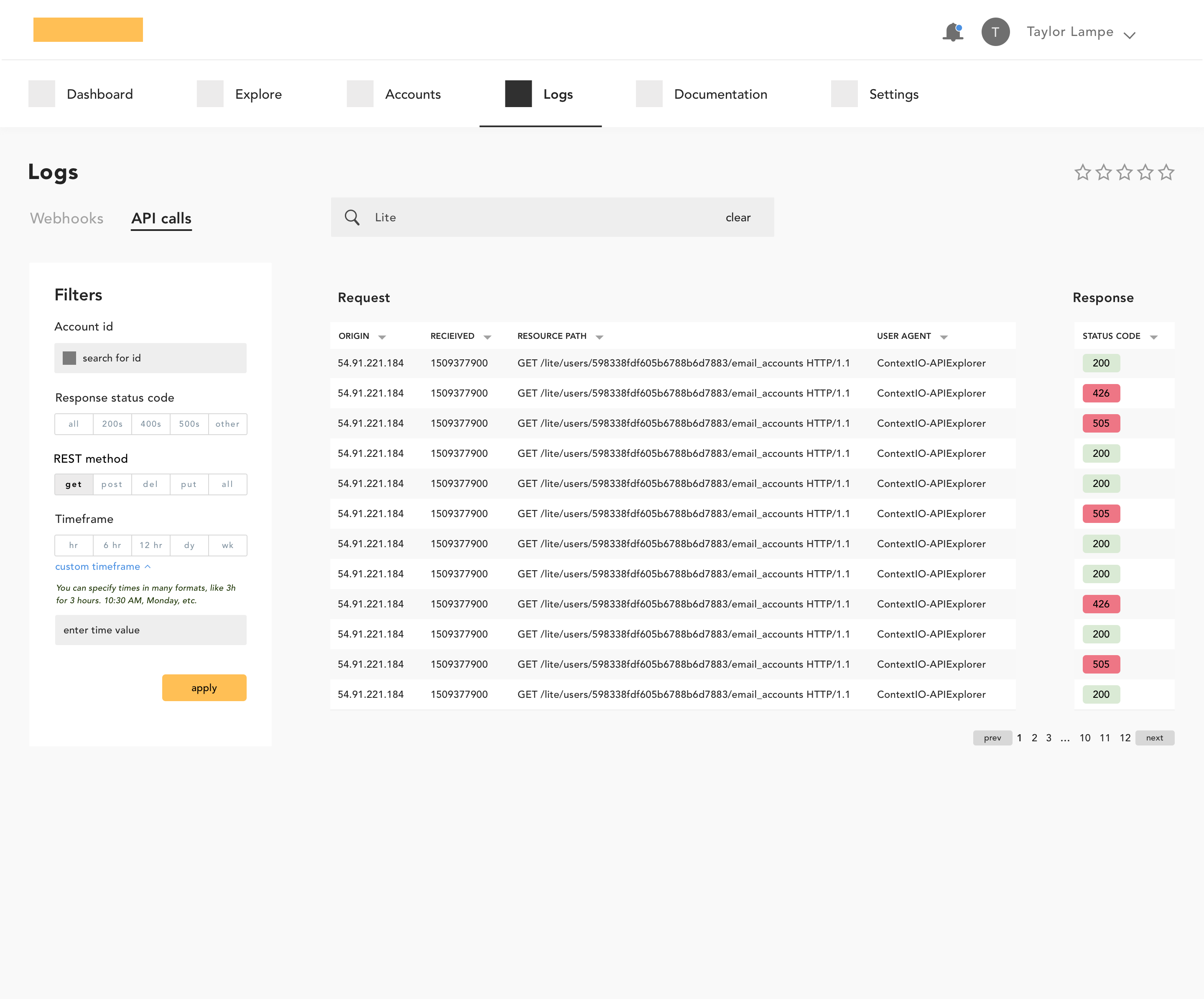
Notes_ section and sub-section search to find details more quickly // full width of screen maximized // clickable response codes with context // more robust filter module
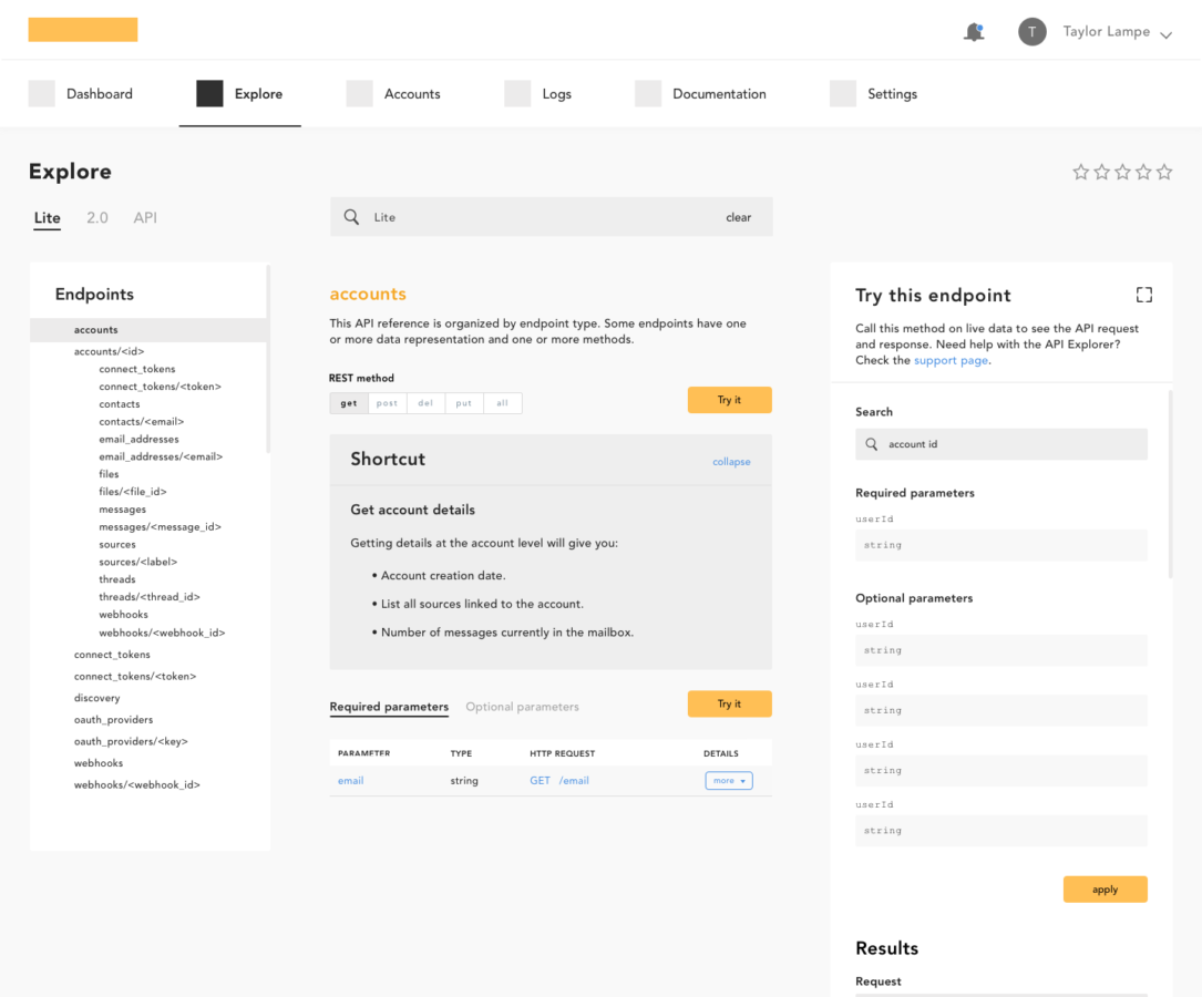
Explore_before
Notes_ lack of any sort of modular consistency or standard // visually noisy // good context around params, but not actionable // separation between learning and doing
Explore_during
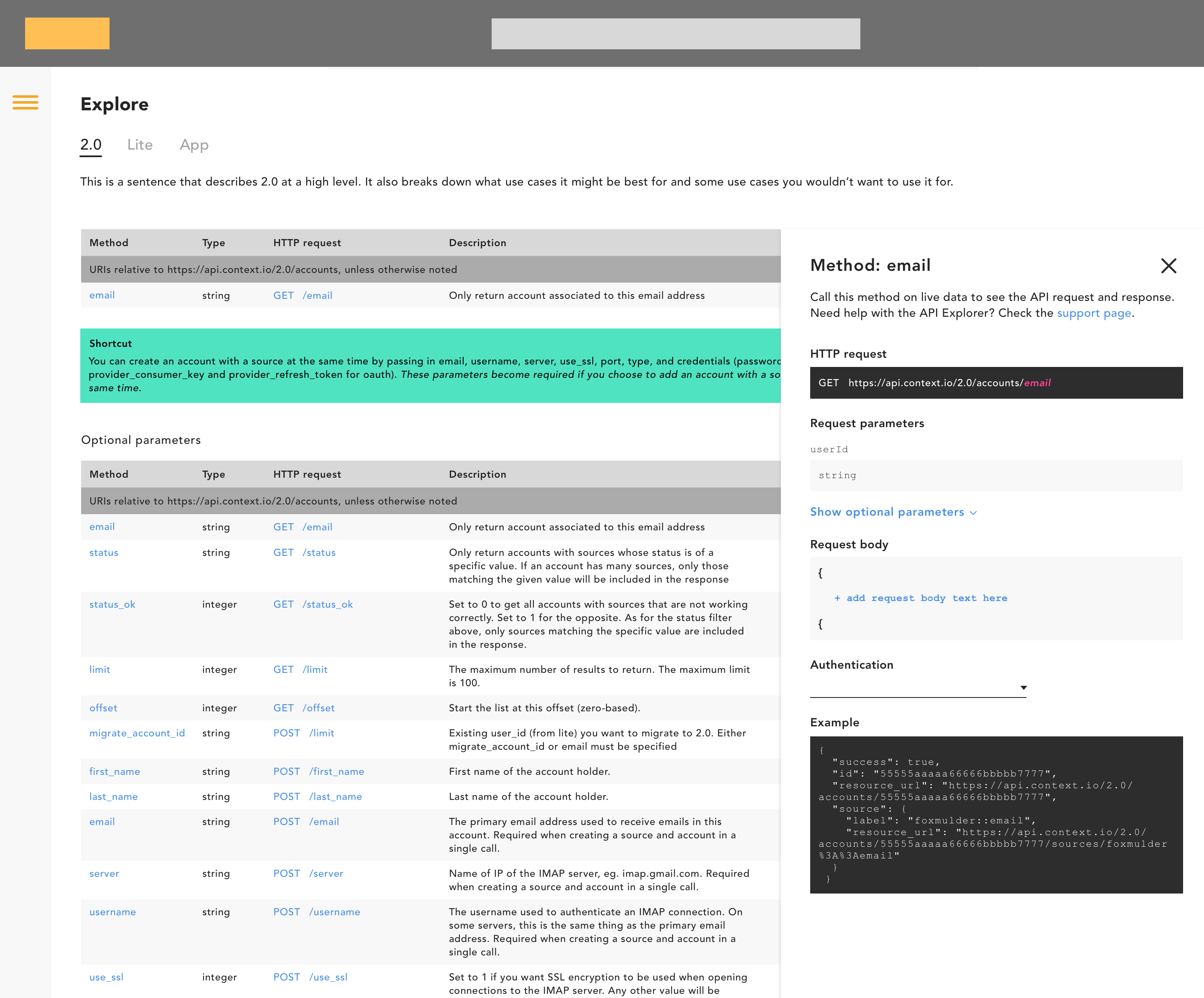
Notes_ still visually noisy // drill through div confusing for usability (see right > method: email) // cluttered table // unessecary context for sub-sections
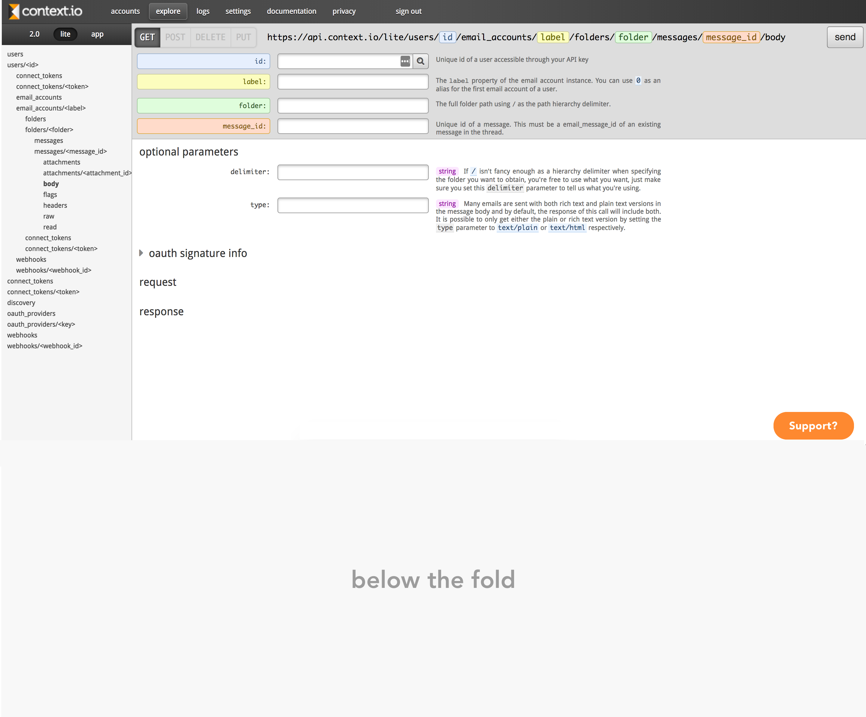
Explore_eventually
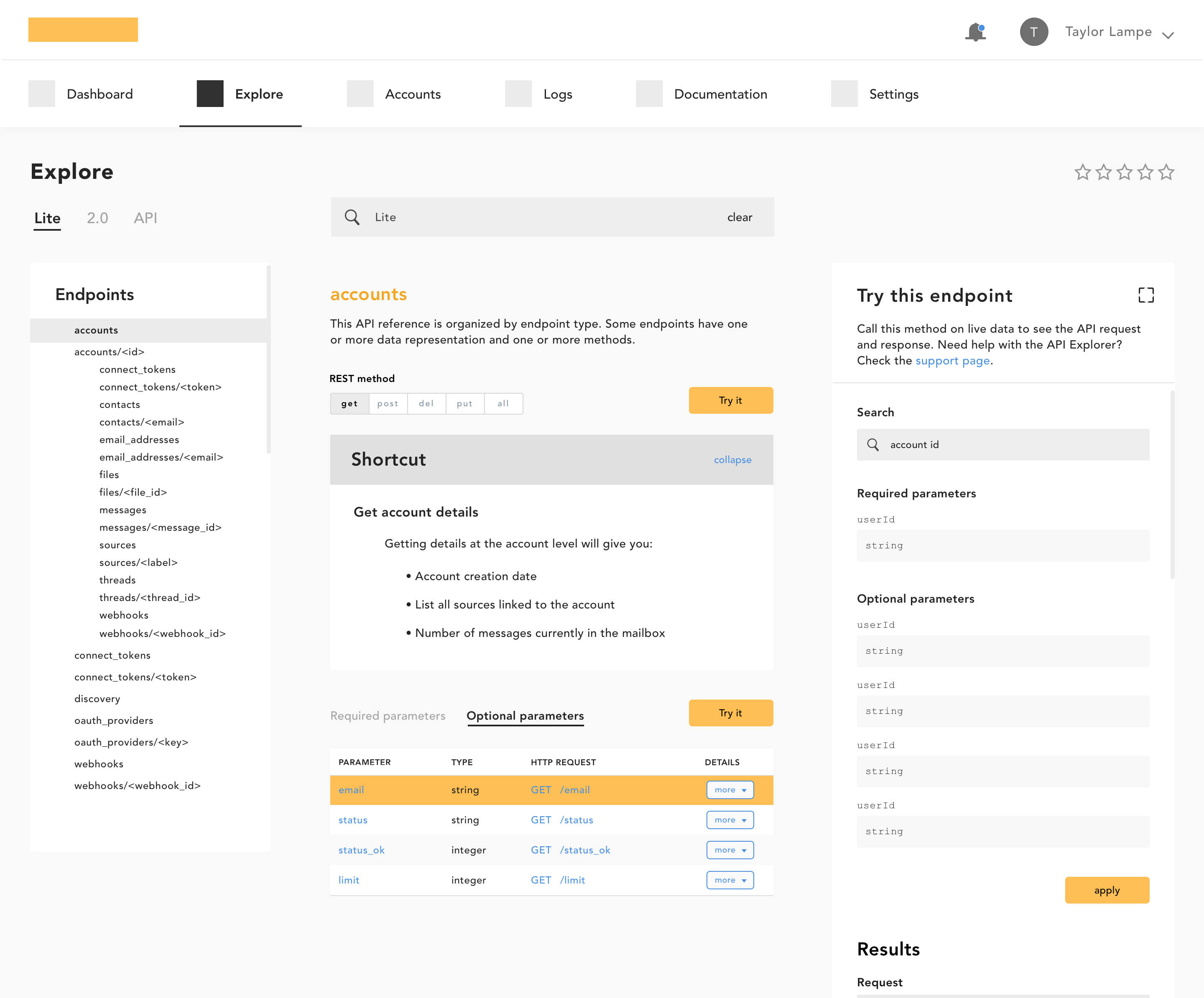
Notes_ reintroduction of Endpoints list for utility // contextual hierarchy (endpoint > REST method > endpoint shortcut > params & details > Try param / test API call) // search
So what?
This new version of Context.io is still in development, limiting the amount of hard, quantifiable measures I can share just yet. We did do many a round of both internal and external testing, though. From that testing, we were able to suss out confident measures of value and usability.
- When asked to define the overall value of the updated experience, ~80% ranked their expectations as "strongly disappointed if the updates weren't shipped".
- When testing the old experience versus variations of the new, each update increased in usability across all of the primary workflows.
- Tons of positive ad hoc comments from testers in regards to their ability to test and learn about both the API and console from the get-go.
© taylor lampe - the year is 2018