RP design system
Designing, documenting and learning from Return Path's first ever design system.
Overview
Early on at Return Path, I was a part of an initiative focused on design systems and documentation for our digital products - specifically product design, user experience and best practices for working with engineers to build and ship products/updates at scale.
Designers and developers weren't speaking the same language, mocks were morphing into monsters and the timing was absolutely perfect.
Role _ research / ux / visual
Tools _ hopes & fears / affinity mapping / red route-ing / comparative analysis / user stories / to-be scenarios / user testing
Colleagues _ daniel price (designer) / jill butcher (principal developer) / jon bell (design manager) / krista rogers (researcher)
Status _ shipped and in-use
Gathering context
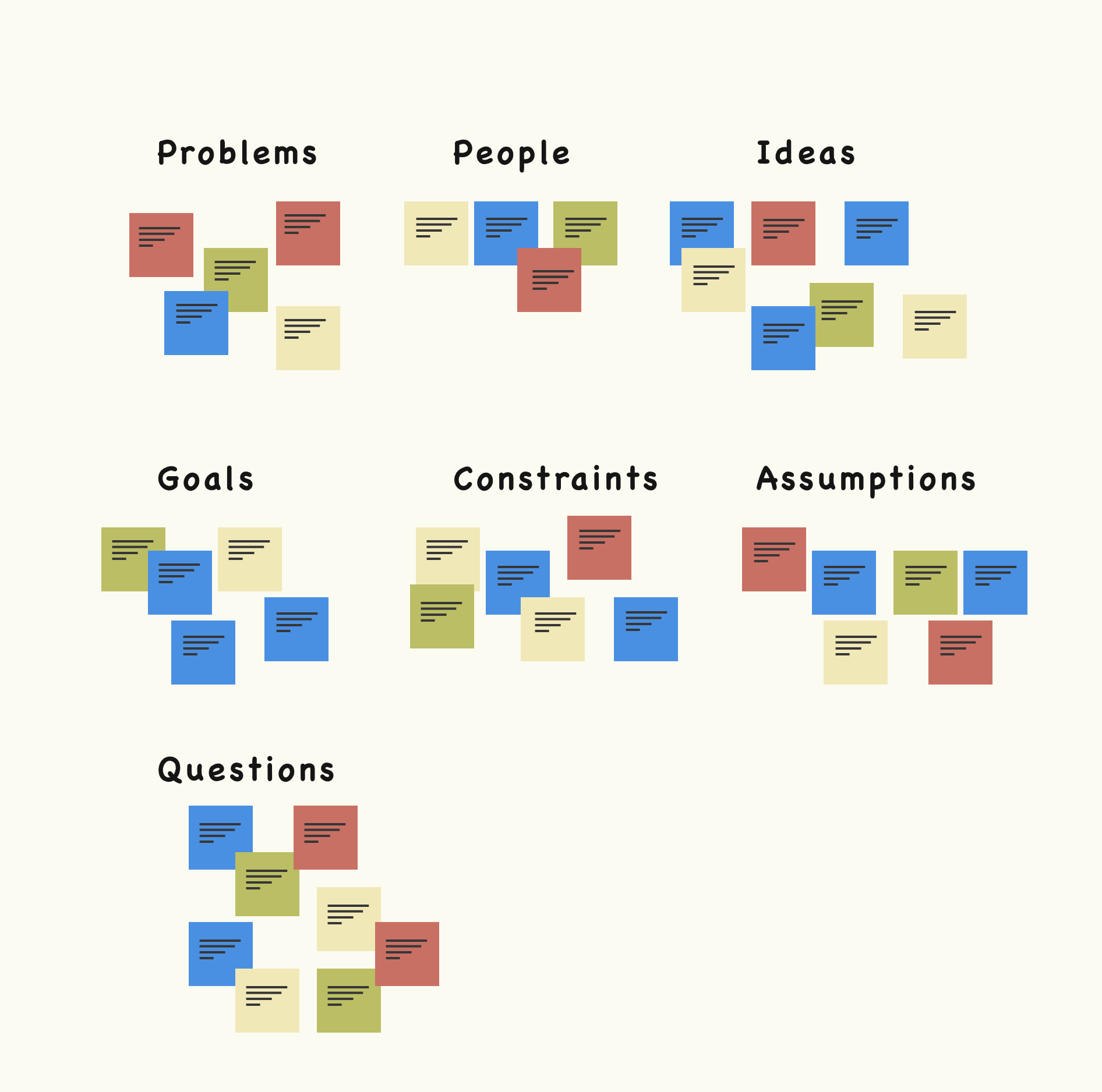
Context is everything so we brought together a multi-disciplinary group of people to talk through what we knew and didn’t know going into the project. In order for us to have concrete next steps, we had to talk through the following things:
- the different problems that got us to this place
- the people having those problems and why they matter
- how we thought we could solve those problems
- our goals
- our constraints
- our assumptions
- the questions we still had
Project plan
After two separate meetings between stakeholders and team members, we (2 designers & a researcher) came to a place of clarity. Our next steps were to:
- work with VP of product and engineering manager(s) to audit the current suite of tools (taylor + krista)
- work with Marketing to inventory the product today so that we could define the visual attributes we wanted to push into the future (taylor)
- define our UI elements by looking at the old UI, talking to users and testing new ideas (taylor + daniel)
- define how we were going to manage the system over time (product org)
- test (taylor + daniel + krista)
1A. Auditing the product suite
To audit the old experience effectively, I decided that the best course of action was to lay out the products, screens and flows holistically so that we could make decisions with a big picture view. Pre-work included working with our UX researcher to prepare user & usage data to help stakeholders get up to speed and make better decisions with objective context.
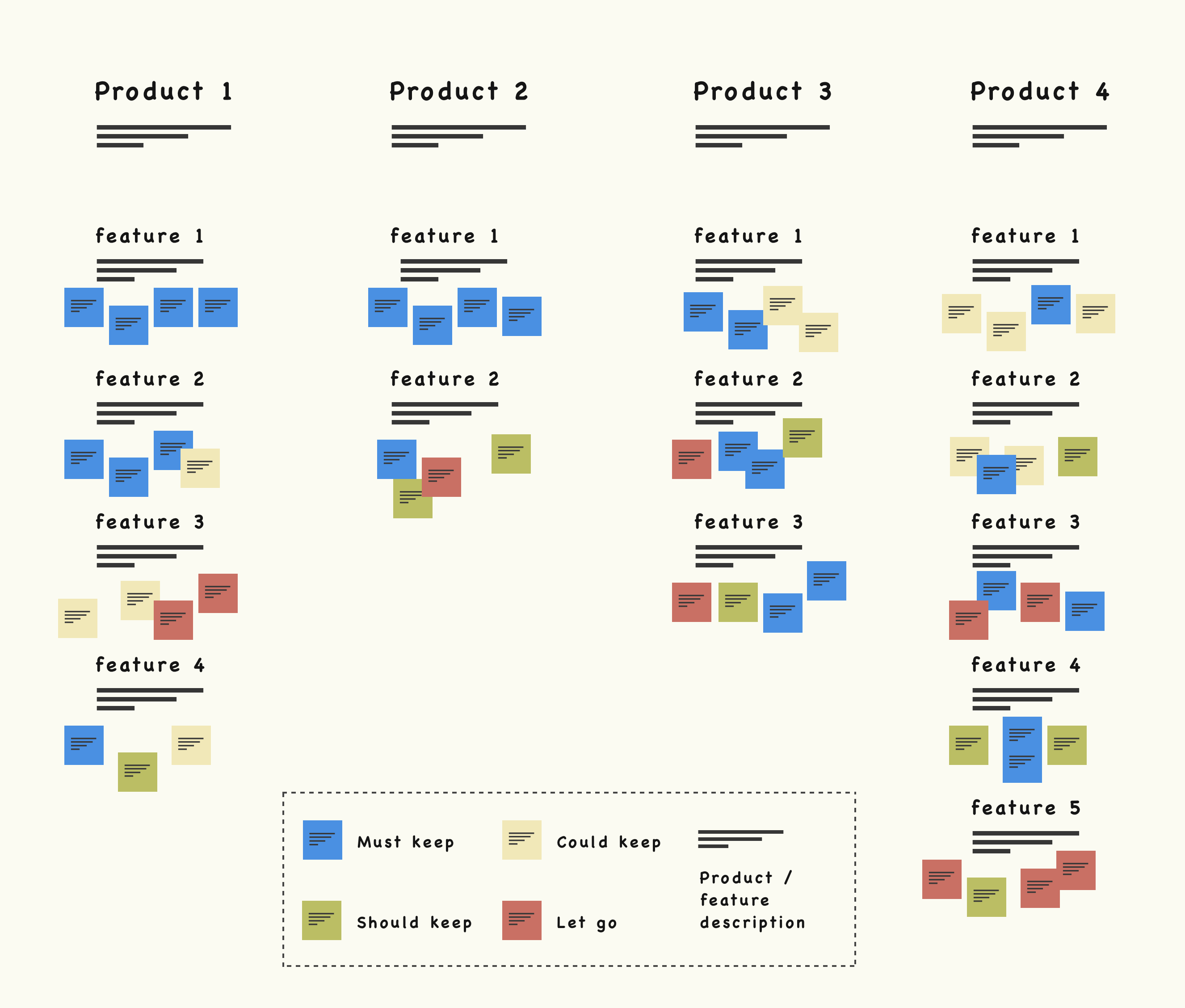
Step 1_ Silently place sticky notes over products and features. 10 minutes
Step 2_ Stakeholders briefly giving reasoning behind sticky notes. 20 minutes
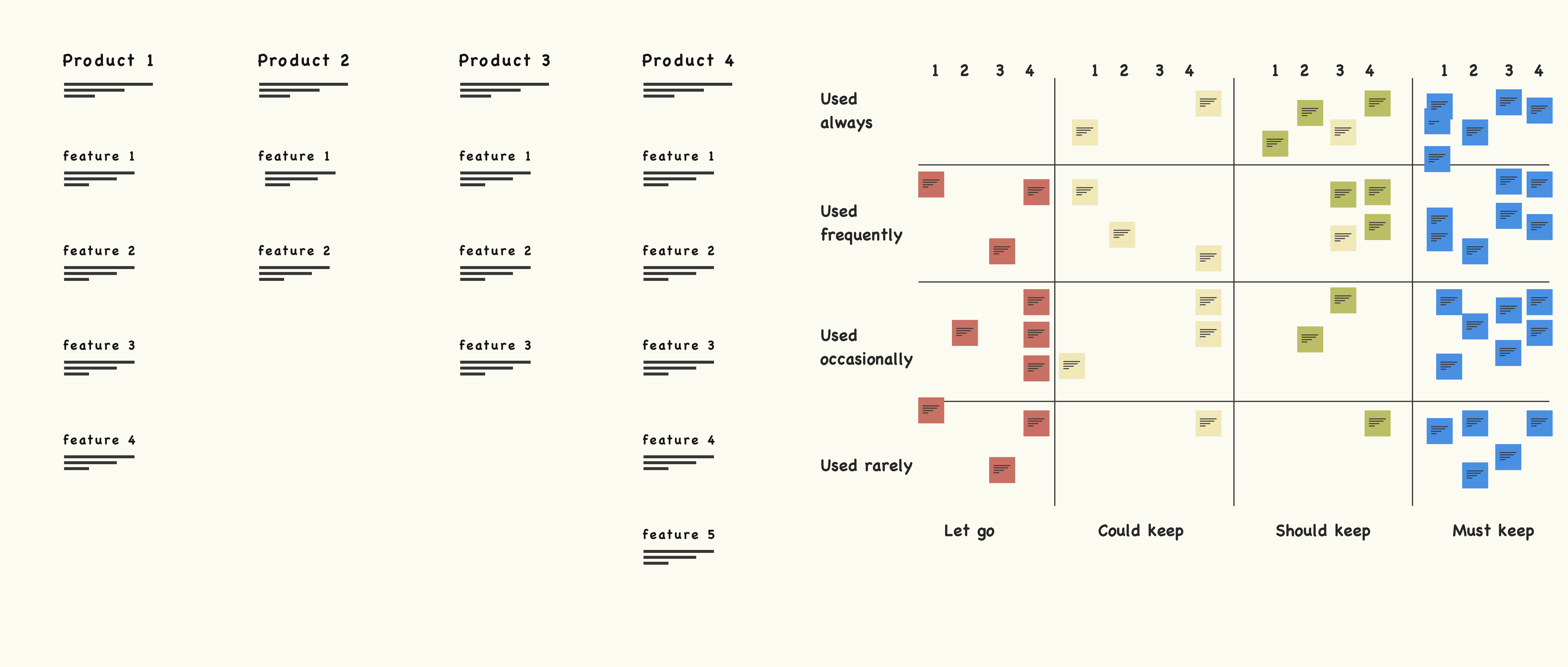
Step 3_ To make our time worthwhile, we needed to walk away from the activity with confident decision making. To do this, we placed the stakeholder sticky notes across a red route matrix based on user and usage data. We didn't want to make stakeholders feel wrong, but we did want to reinforce the decision making with objectivity. 5 minutes
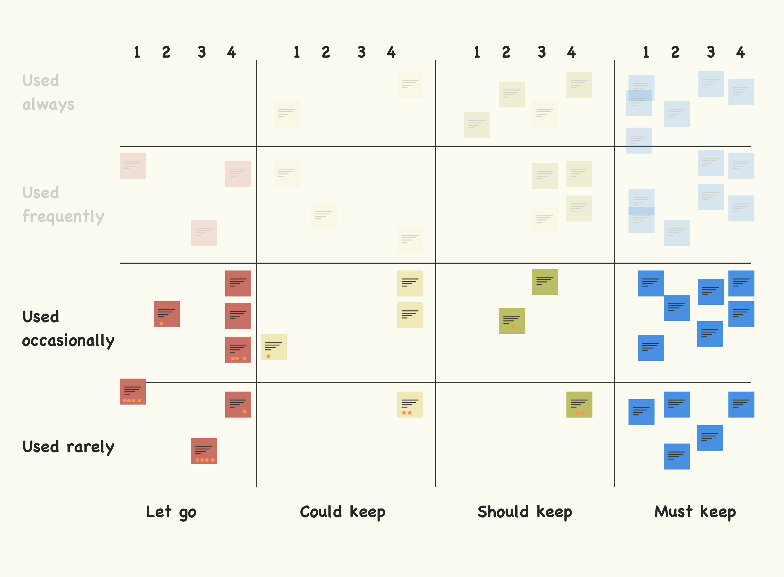
Step 4_ We plotted opinions across objective data and then dot voted what to cut for JUST the Used rarely & Used occasionally sections of the red route. 20 minutes
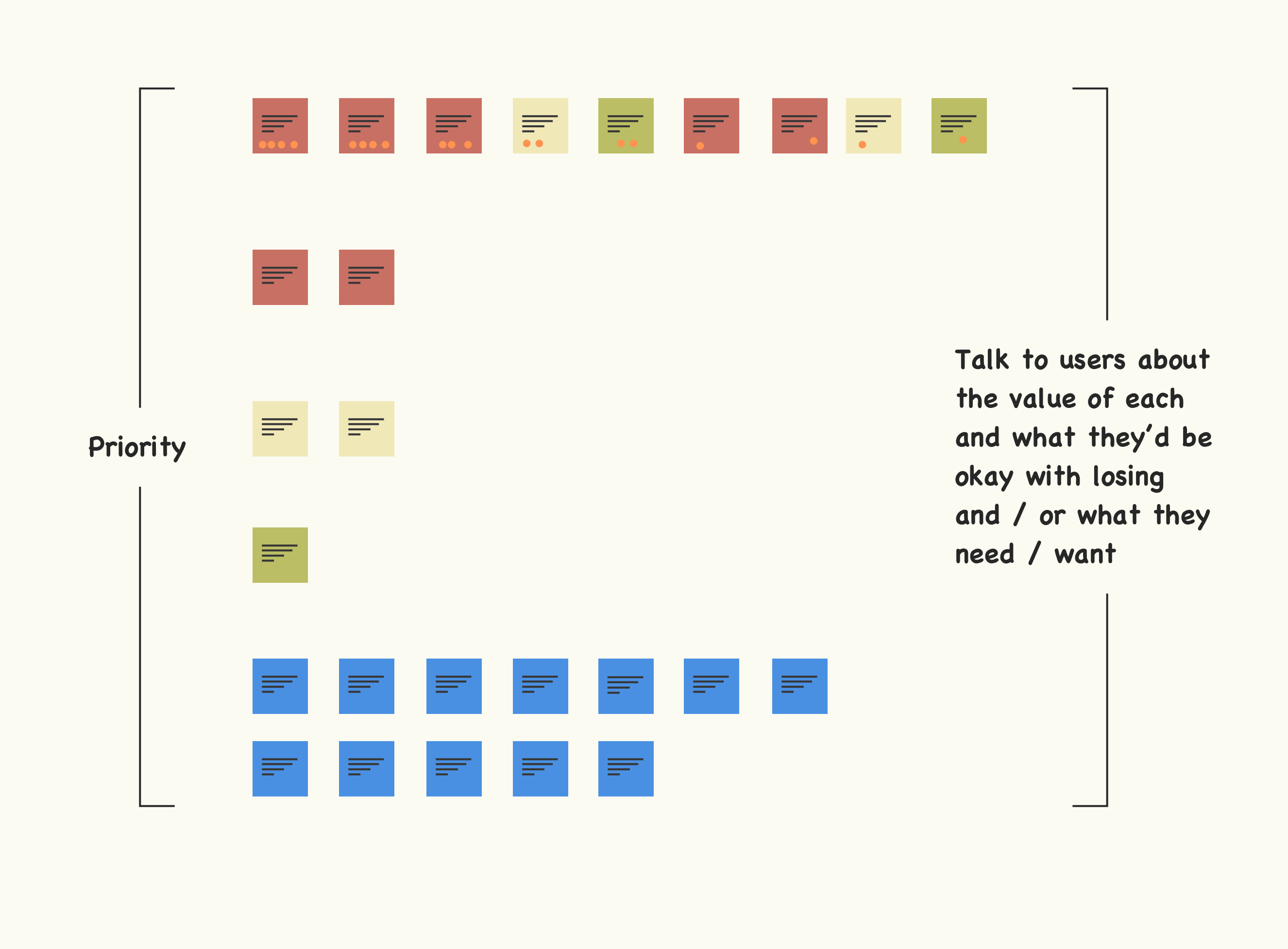
Step 5_ Krista and prioritized the features and tools from most dots to none and included every sticky in those two sections. From there, Krista was going to reach out to users to better understand the problems of each and the associated user value.
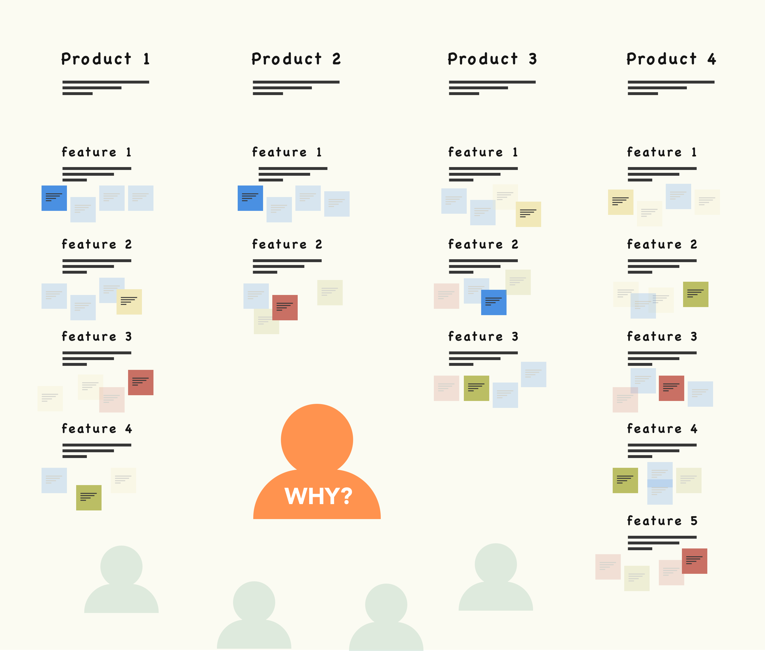
1B. Why it matters
By giving decision makers a high-level view of how everything connected, feature usage, user types and issues, we were able to more efficiently communicate points of view and allow them to make informed and confident decisions.
Next steps
Validating our voting with users to ensure we were focusing in on what to keep, what to fix and what to cut.
Working with Marketing & Engineering
I worked closely with both departments to better understand constraints and to prevent us from doing the same work in different ways. These conversations strengthened collective buy-in across departments because it showcased just how broken the consistency and efficiency aspects of design & development and even marketing were. Our conversations were focused on:
- Marketing: they own the brand aspect of the business and we didn’t want to waste time or step on toes when it came to the visual aspects of the design system
- Engineering: they had a workflow we needed to consider AND they also had CSS information that would help inform various conversations (types of font in use, number of colors, unique declarations, etc)
Separating a design system from the re-designs
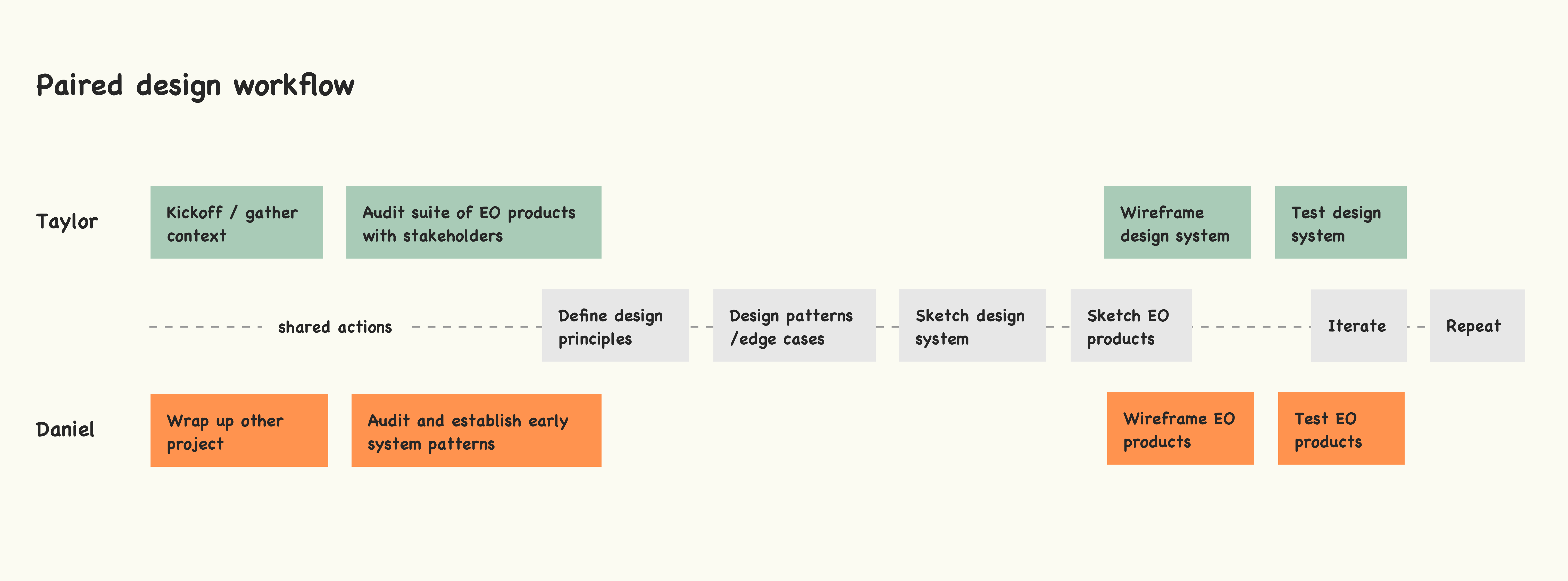
Daniel took the audit details and user research and led the early charge on defining the more generalized elements. His focus was to use the data to start developing patterns and components that were focused on the Email Optimization products. While I helped ideate and make the bigger components and regions on a per product basis, my focus was on the system itself and the people who'd use it. We pulled a ton of inspiration from a guy named Nathan Curtis. His experience and insights were priceless as we balanced the redesign of our core products and developed an operating system for multi-disciplinary teams to make more things more efficiently.
Making, testing, iterating and shipping
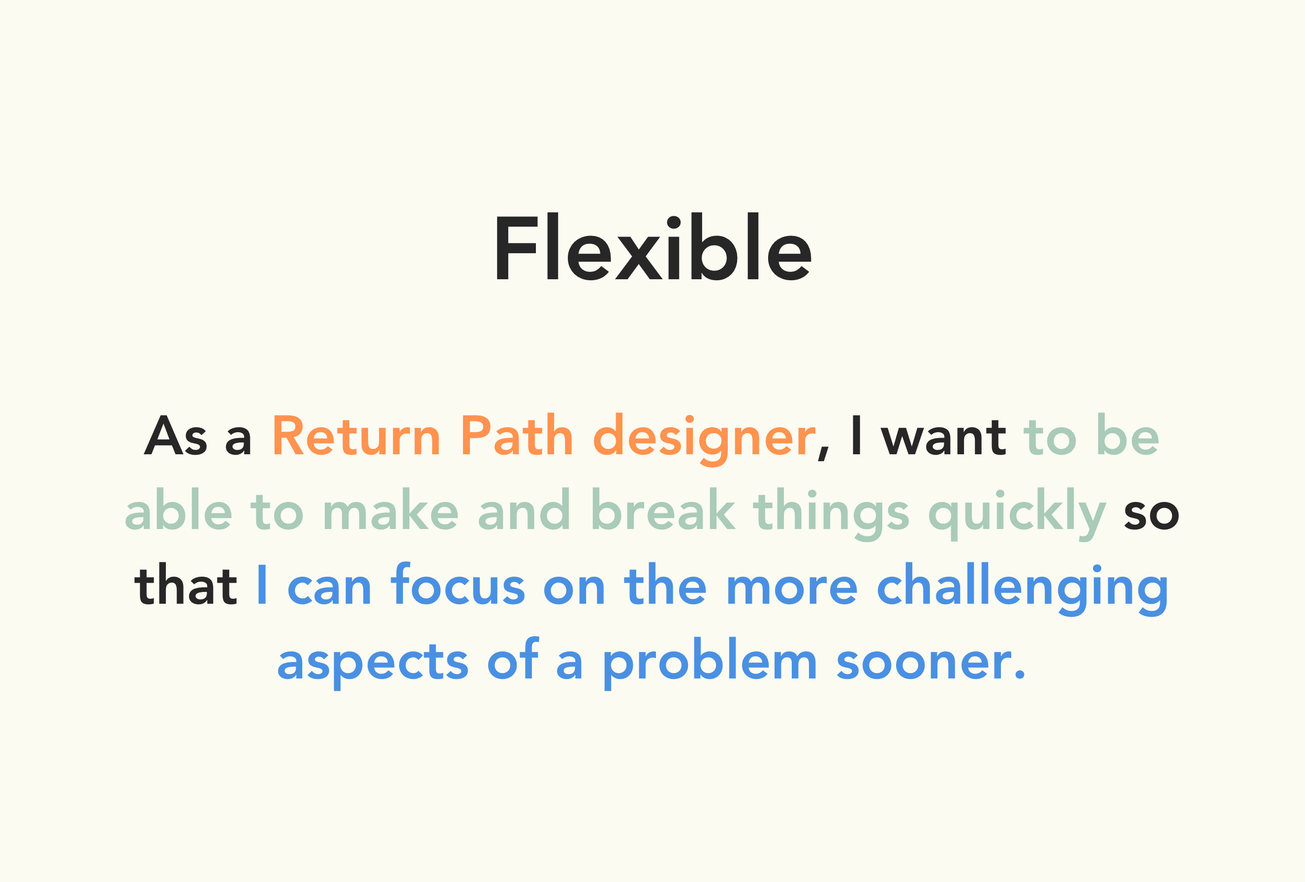
We spent an entire quarter focused on building the design system and we used our two primary EO products to help guide the development of the design system. Our goal was to build a system that was actionable, clear and flexible but we needed to re-design and test as many products as possible as we did so. This is why Daniel and I worked together but separately.
Design principles
So that we could work independently but still drive towards the same goal, we aligned with our user researcher Krista to define our core design principles. We went over the Email Optimization personas, our internal personas, the red route I had previously defined with stakeholders and the research Krista had done post red route to accurately define what our users needed and expected most from us. Remember, because my focus was on the internal teams using the design system, I'm only sharing the details that applied to those users.
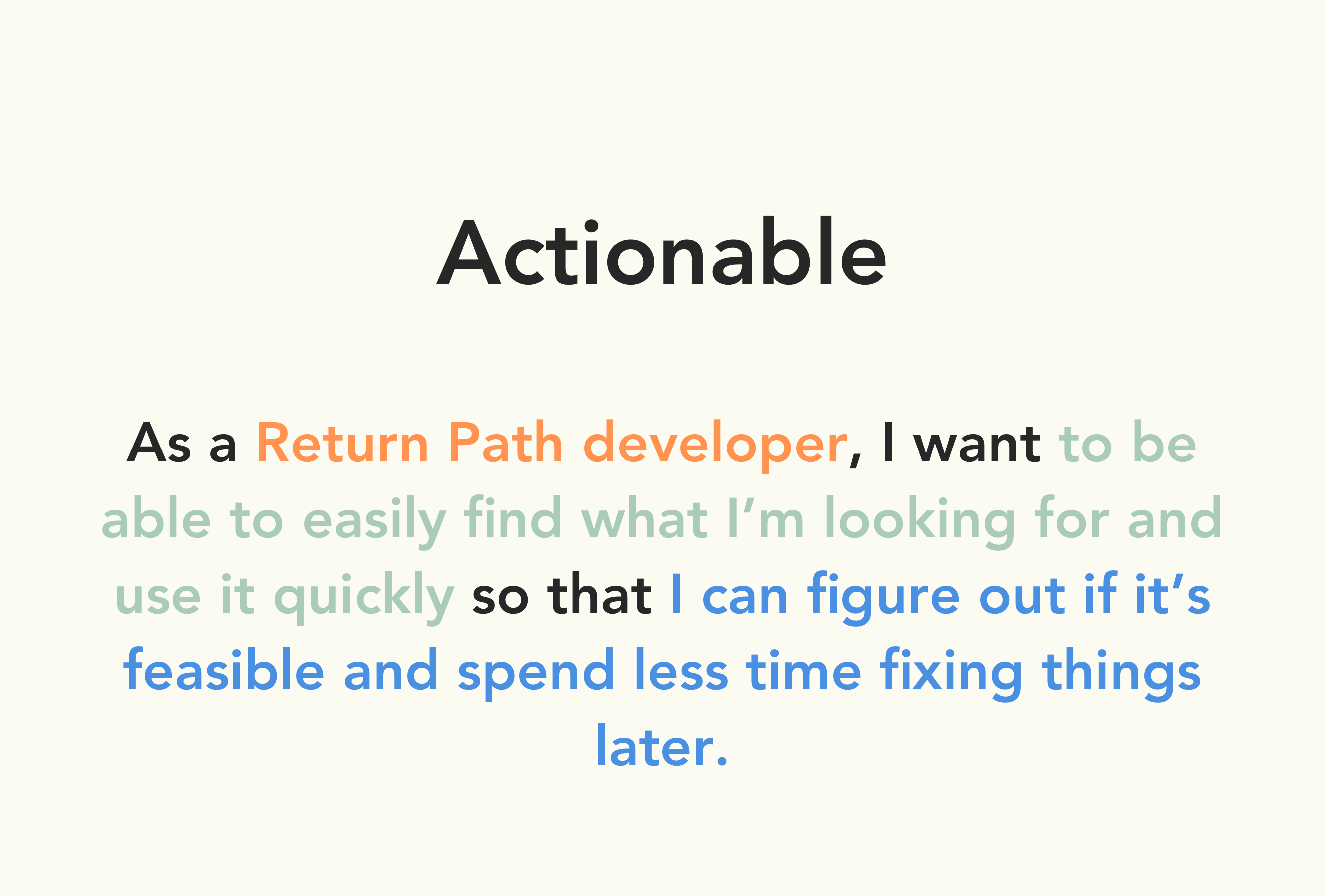
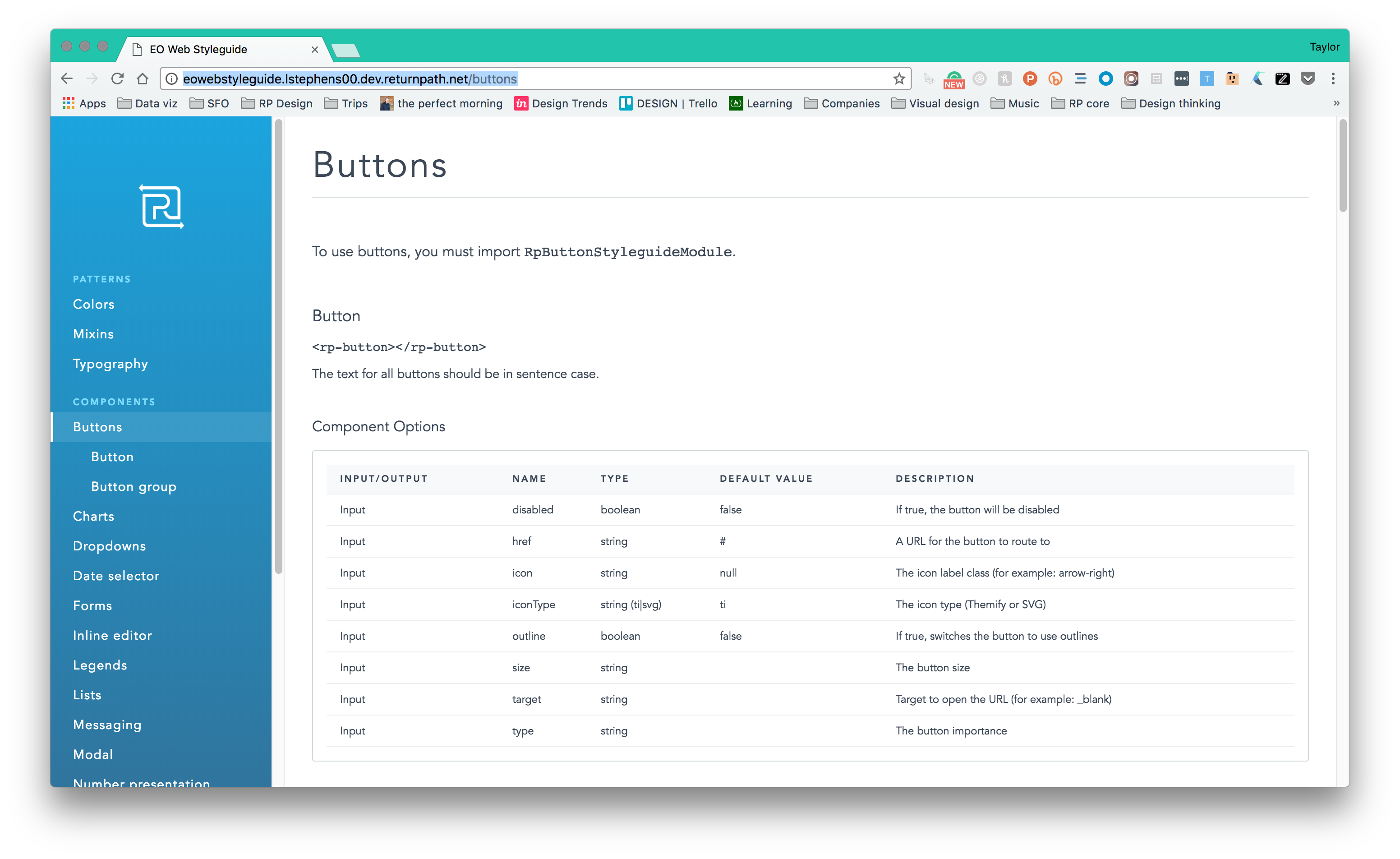
RP developers use engineering syntax and conventions to communicate and get the job done. It was important that we accounted for that lense as they were a primary user.
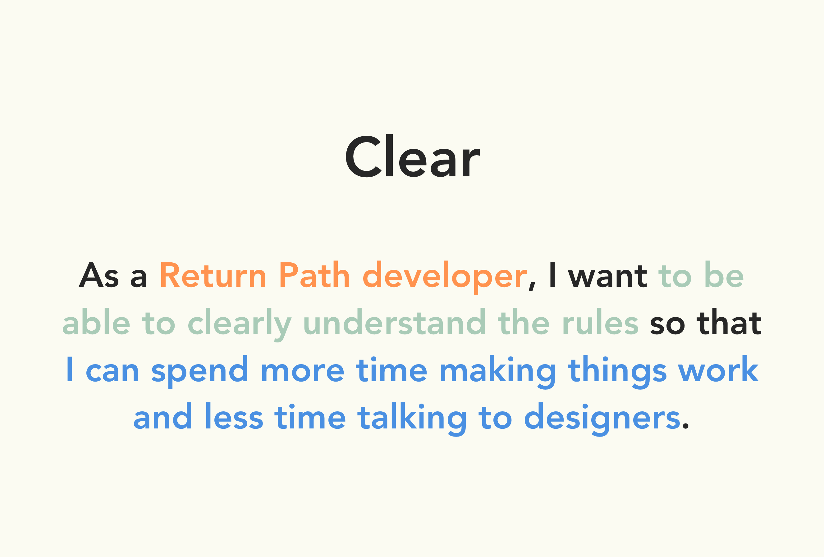
To mitigate unnecessary comms and the incorrect application of the design system, we needed to make sure developers understood the why, when and how when using our system elements.
One of the hardest aspects to consider was how the system would and should change over time. We needed to design for today's context, but also create a safe space and way to activate changes when needed.
Prioritizing patterns
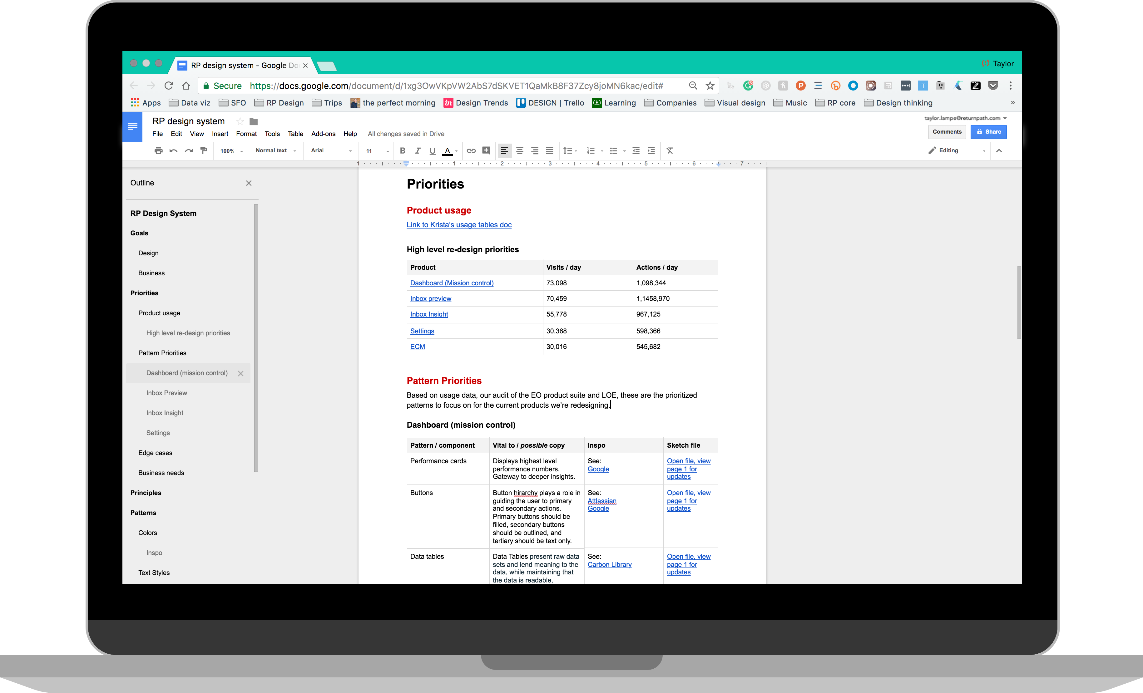
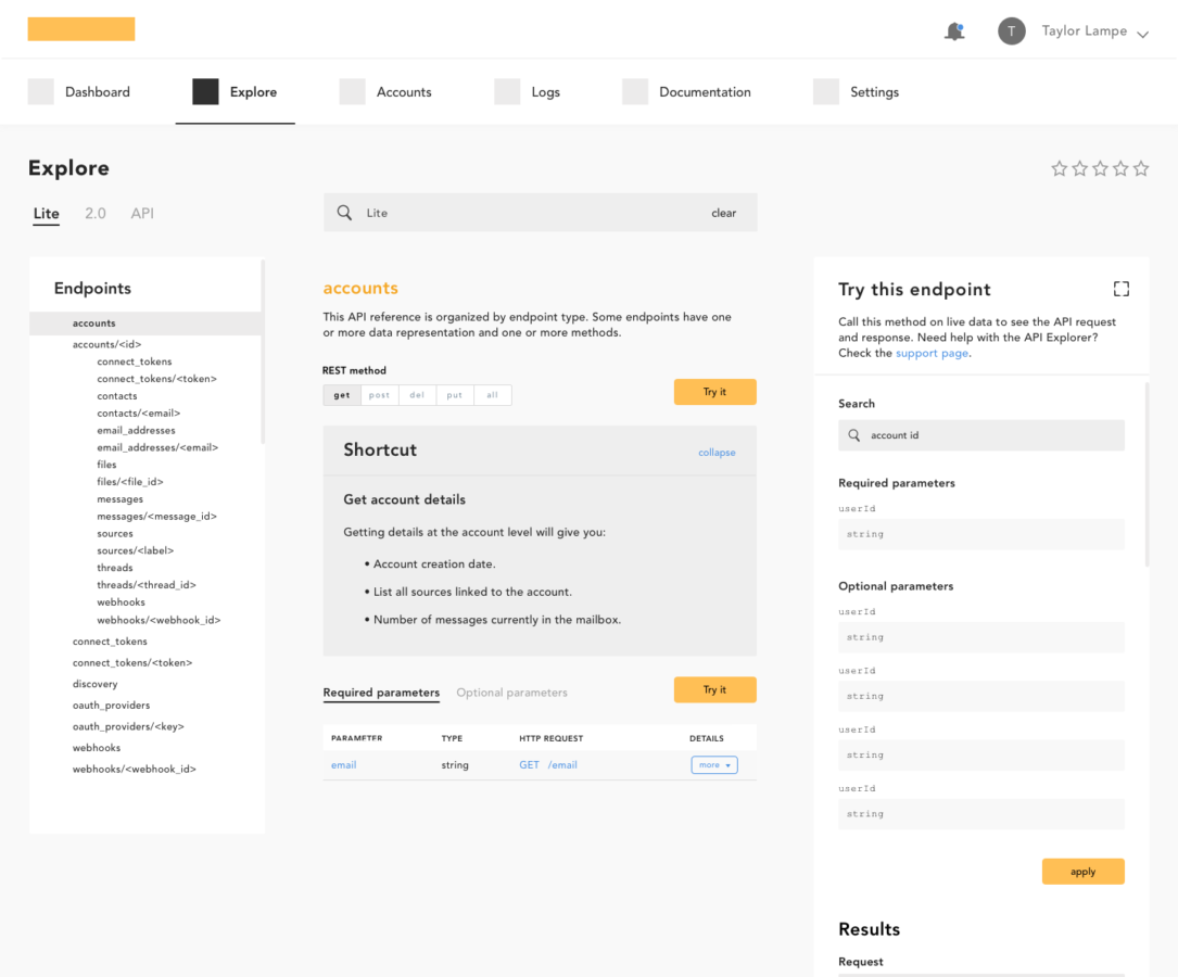
What started as a document to organize priorities and patterns slowly evolved into the "source of truth" project doc. It included business & design goals, comparative audit info, links to inspiration, and even outlines for organizing the design system (an early version of the eventual Sketch file).
When it came to prioritizing, we looked at usage data, audit synthesis and level of effort to pinpoint what to focus on.
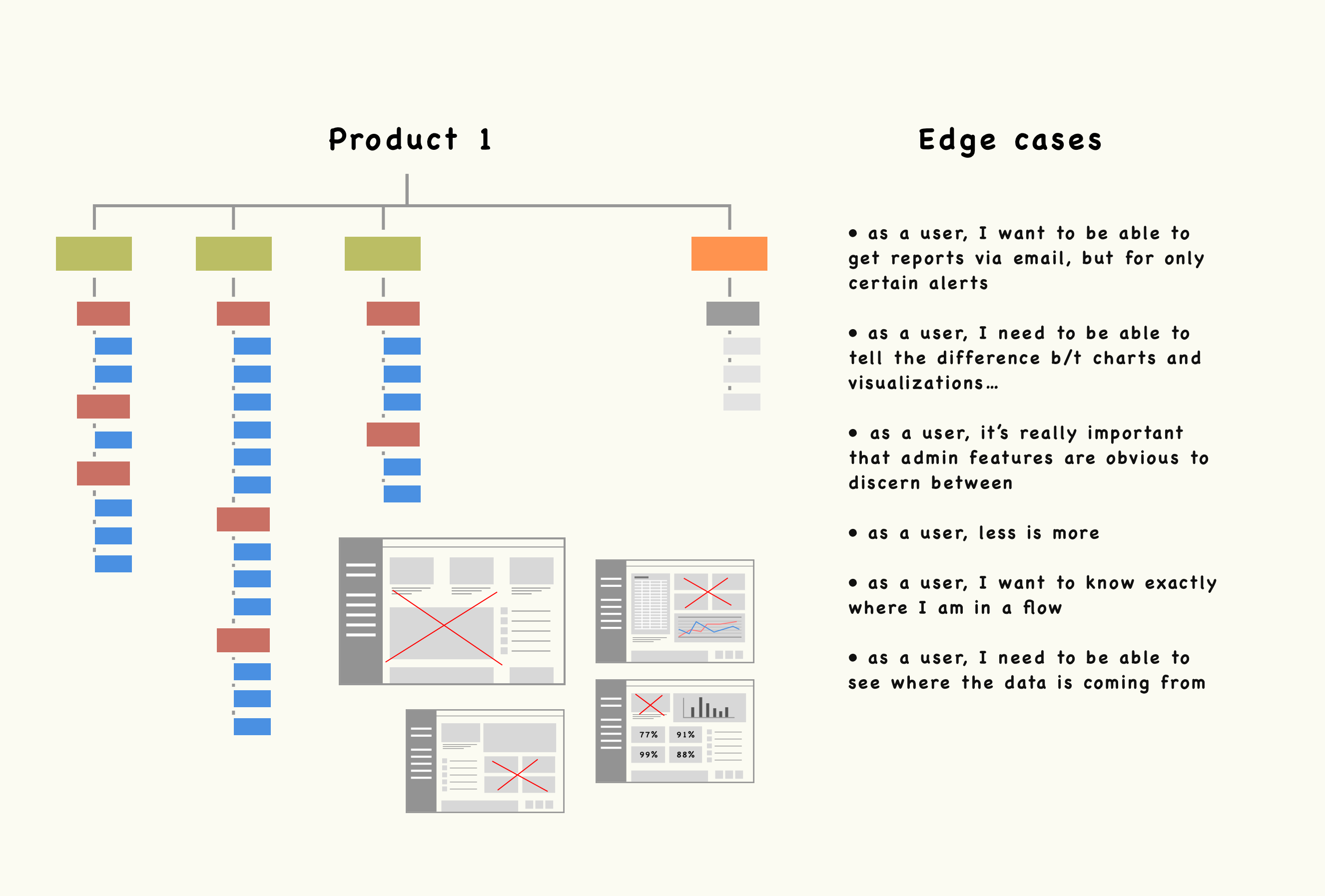
Edge cases
Defining edge cases was extremely helpful because it gave constraints to the way we solved problems. We'd zoom in on each product or feature, and then zoom out and ask ourselves if the solution could scale across other products and the different types of problems. The corresponding image depicts the process of outlining each product, lo-fi wireframing, considering the high-level edge cases, and then iterating accordingly.
Managing the system over time
Back to our man Nathan Curtis, he speaks a lot about 3 types of ways to manage a Design System: solitary, centralized and federated. The federated model spoke to us the most because its general premise is “many team members from across the company come together to work on the system”. We wanted our system to have shared buy-in, scale over time and live on regardless of who comes and goes.
So what?
At times, quantifying the impact of design can be very challenging. Design Systems, however, are fairly simple to quantify. These are some of the numbers we were able to present a few months after we had tested and shipped a few product updates using the design system:
- All 8 of the Email Optimization products have been tested and shipped after just 9 months of the design system being finished. Each one was a major overhaul that also included testing and iterating (on the system & the product). What was taking a quarter and a half to ship now takes on average 2.5 months.
- ~ 70% decrease in negative user feedback via the ever-present feedback widget.
- A considerable increase in NPS
© taylor lampe - the year is 2018